Test it your self and see how it works!
To see how it works you wont need a tablet or mobile, you just resize your browser window you see how text and images are resizing which eliminate horizontal scroll bar on browser i.e user wont need to move his page on his mobile or tablet to see image or text.
See Pricing
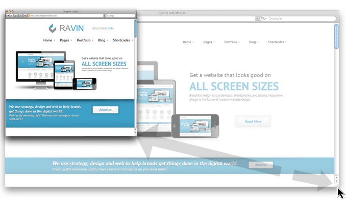
 Beautiful design across desktops, smartphones, and tablets; responsive design is the future of modern website design
What is Responsive Website Design?
A responsive website is a single website that adapts to the device of each unique visitor, whether desktop, smartphone, or tablet. A responsive website dynamically re-sizes its content and imagery for a variety of different screen sizes in order to ensure the website is effective and easy to use on any device.
- Our responsive website designs increase mobile conversion rates.
- Preferred by search engines like Google,Yahoo!,etc, responsive design will bring your site more mobile traffic..
See Pricing
Why should I use Responsive Website Design?
Responsive website design is a cost efficient approach to designing for today's growing mobile market. Some primary reasons to choose responsive design for your website include:
Rapidly growing mobile usage
Mobile web usage is growing at an extremely rapid rate that presents enormous opportunity. A website that is not optimized for mobile usage and performance stands the potential to leave an enormous amount of opportunity and business on the table. Our professional responsive designs deliver outstanding results from both desktop and mobile users.
Efficient in terms of both time and cost
Responsive website design can drastically cut down on development time and cost. Rather than spending the time and resources building a separate mobile website in addition to your traditional desktop website, the responsive design approach enables you to optimize your business for both desktop and mobile with a single website.
Best practice for ranking high in mobile search results
Responsive design is the preferred option when it comes to making your website both mobile and search engine friendly. By providing a single, dynamic version of your website to both desktop and mobile visitors, you make it easier for search engines to understand and serve your content.
See Pricing